
As we approach 2025, mobile usage continues to dominate the digital landscape, making Mobile SEO more crucial than ever. Search engines, particularly Google, have already shifted to Mobile-First Indexing, meaning they prioritize the mobile version of your website when determining search rankings. To remain competitive, businesses must optimize for Mobile-First Indexing and mastering Mobile SEO in 2025.
This blog will explore the best practices for Mobile SEO and how to ensure your website is optimized for Mobile-First Indexing.
What is Mobile-First Indexing?
Mobile-First Indexing is a process where Google predominantly uses the mobile version of your website for ranking and indexing. This means that when Google analyzes a site, it looks at how the site performs on mobile devices first. If your website doesn’t work well on mobile, it could hurt your rankings, even if the desktop version looks amazing.
This change makes sense when you consider how many people browse the web from their smartphones. Google’s goal is to provide the best user experience possible, and if users are primarily on mobile, the mobile version of websites becomes the priority. That’s where Mobile SEO becomes essential.
Why Mobile-First Indexing Matters for Mobile SEO
If you want your website to rank high on Google, you must optimize it for mobile users. This is where Mobile SEO comes into play. Mobile SEO involves making sure that your site is easy to navigate, loads quickly, and provides a good user experience on smartphones and tablets.
In a world driven by Mobile-First Indexing, Mobile SEO is no longer optional. If your site isn’t mobile-friendly, Google might rank it lower. This could result in fewer visitors and potential customers.
How to Check If Your Site Is Ready for Mobile-First Indexing
Google provides tools like the Mobile-Friendly Test to see if your site meets Mobile SEO standards. You can also use Google Search Console to check how Google views your mobile site.
Remember, in the era of Mobile-First Indexing, focusing on Mobile SEO is crucial. The better your mobile site performs, the higher your chances of ranking well on search engines.
Key Aspects of Mobile SEO for Mobile-First Indexing
Let’s explore the key ways to optimize for Mobile-First Indexing and excel at Mobile SEO.
1. Mobile-First Indexing: Ensure Responsive Design
The foundation of mobile SEO is responsive design. A responsive website automatically adjusts its layout to fit different screen sizes, providing an optimal viewing experience on both desktop and mobile devices. Since Mobile-First Indexing relies on how well your website performs on mobile, responsive design is crucial.

In Mobile SEO in 2025, websites that fail to provide a seamless mobile experience will suffer in rankings. Therefore, ensuring your website adapts to various screen sizes is one of the first steps to optimizing for Mobile-First Indexing.
2. Mobile SEO: Improve Page Load Speed
Page load speed plays a vital role in user experience and SEO rankings, especially in Mobile SEO. Mobile users expect websites to load quickly, and slow load times can lead to higher bounce rates. Since Mobile-First Indexing takes mobile performance into account, optimizing for speed is essential.

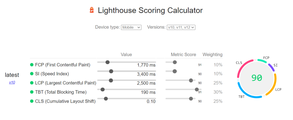
Lighthouse Scoring Calculator
To excel in Mobile SEO, compress images, reduce the use of large files, and minimize unnecessary code. Tools like Google PageSpeed Insights can help you identify areas where your mobile website can be optimized for speed, ensuring you’re fully aligned with Mobile-First Indexing.
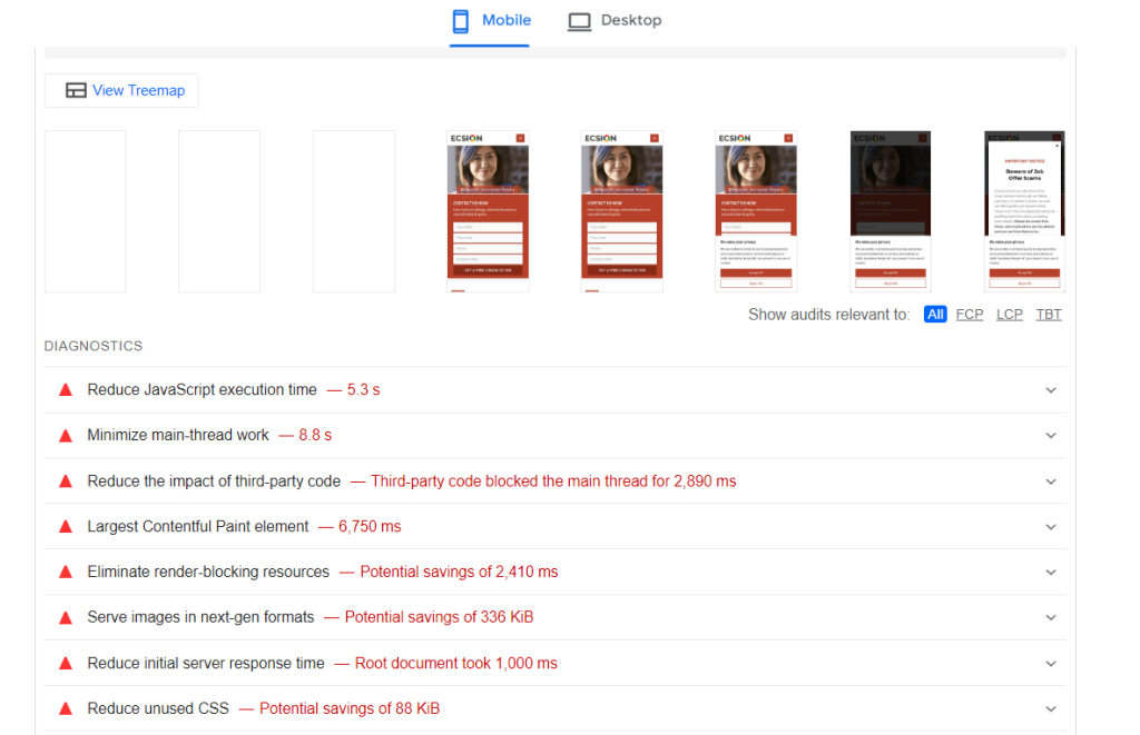
= Reducing file sizes will help improve loading times and overall user experience
3. Mobile-First Indexing: Focus on Mobile-Friendly Content
Content is at the heart of Mobile SEO, but how that content is presented on mobile devices is equally important. Since Mobile-First Indexing uses the mobile version of your site to determine rankings, your content must be mobile-friendly. This means using shorter paragraphs, bullet points, and subheadings to break up content for easier reading on small screens.
For Mobile SEO, ensure that your most important information is easily accessible, and avoid pop-ups or elements that could disrupt the user experience on mobile. Mobile-friendly content is a key factor in succeeding with Mobile-First Indexing.
4. Mobile SEO: Optimize for Voice Search
Voice search is a growing trend, and optimizing for it is crucial for Mobile SEO. With more users relying on voice assistants like Siri, Alexa, and Google Assistant to find information on the go, businesses need to ensure their content is voice-search optimized. Voice queries tend to be more conversational, so focus on long-tail keywords and natural language.

Incorporating voice search optimization into your strategy for Mobile SEO will not only help you rank higher for mobile searches but also ensure you stay ahead in the mobile-first landscape.
5. Mobile-First Indexing: Use Structured Data
Structured data is another essential element of Mobile SEO. By adding schema markup to your website, you help search engines understand your content better, which can improve how it’s displayed in mobile search results. Since Mobile-First Indexing prioritizes mobile content, using structured data can give your site an advantage by making it more visible and accessible in mobile search.
When implementing structured data for Mobile SEO, focus on mobile-specific content, such as local business information, product details, and event listings. This will enhance your chances of being featured in rich snippets and other prominent search result features.
6. Mobile SEO: Optimize Images and Videos for Mobile
Visual content is important for both user engagement and SEO, but it must be optimized for mobile to succeed in Mobile SEO. High-resolution images and videos that are not compressed can slow down your site, negatively impacting both user experience and your rankings under Mobile-First Indexing.

To thrive in Mobile SEO, ensure your images are optimized for fast loading on mobile devices by using the right file formats and compressing them without sacrificing quality. For videos, consider using formats that load quickly on mobile devices and include captions for accessibility.
7. Mobile-First Indexing: Monitor and Test Your Mobile Performance
To ensure you’re succeeding in Mobile SEO, it’s crucial to regularly monitor and test your website’s mobile performance. Tools like Google Search Console allow you to check how your website is performing under Mobile-First Indexing and identify any issues that may be affecting your rankings.
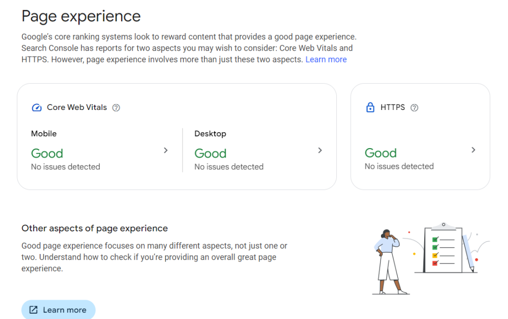


Regularly test your mobile site using Google’s Mobile-Friendly Test tool, and continuously optimize your content and design based on the insights you gain. Consistently monitoring your mobile performance will help you stay ahead in Mobile SEO in 2025.
Conclusion: Mobile SEO and Mobile-First Indexing
As we move towards 2025, focusing on Mobile SEO is crucial for maintaining visibility in search engine rankings. With Mobile-First Indexing at the forefront, optimizing your website for mobile performance should be a top priority. By focusing on responsive design, improving page speed, creating mobile-friendly content, and optimizing voice search, you’ll be well-prepared for Mobile SEO in 2025.
To stay ahead, ensure that you are constantly testing your mobile site and refining your strategies to meet the evolving requirements of Mobile-First Indexing. The future of SEO is mobile, and by mastering Mobile SEO, your business will be well-positioned for success in the mobile-first digital landscape.
FAQ (Frequently Asked Questions)
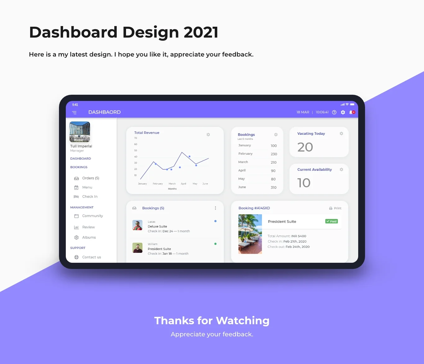 AI in web design is transforming how websites are created and managed. In 2025, the role of artificial intelligence (AI) in web design is set to grow even more, making it easier for designers to build stunning websites with advanced features, improved user experience, and enhanced functionality. Whether you’re an experienced designer or just starting, AI tools can significantly improve your workflow. In this blog, we’ll explore 5 powerful AI tools that will help you create stunning websites in 2025.
1. AI in Web Design: Wix ADI (Artificial Design Intelligence)
Wix ADI is one of the most popular AI in web design tools available today. Wix’s ADI system simplifies the website creation process by allowing users to create stunning websites in just a few minutes. Using Wix ADI, you can input your preferences, such as the type of website you want to create and the features you need, and the AI will automatically generate a fully functional website with your requested elements.
The beauty of Wix ADI lies in its simplicity. It is perfect for beginners who need a fast and professional-looking website without much effort. With the power of AI in web design, Wix ADI not only creates a visually appealing design but also optimizes the layout for mobile devices, ensuring that your site works well across all platforms. It’s an excellent choice for small businesses, freelancers, and anyone looking to establish an online presence quickly.
2. AI in Web Design: Bookmark’s AiDA (Artificial Intelligence Design Assistant)
AiDA, an AI-powered web design tool from Bookmark, is a game-changer for building stunning websites. AiDA leverages machine learning algorithms to design websites in real-time. It works by gathering information about your preferences, such as business type, target audience, and design style. Based on this input, AiDA creates a fully functional and customizable website in minutes, giving you a professional look with minimal effort.
One of the great features of AiDA is its ability to adapt and learn from user feedback. As you make changes to your website, AiDA refines the design and suggests improvements. This makes it an incredibly useful tool for designers who want a simple, fast, and responsive platform for building websites. With AI in web design, AiDA helps you achieve stunning designs without needing extensive coding knowledge.
3. AI in Web Design: Figma
Figma is a powerful design tool that uses AI to streamline the web design process. Although it is not fully automated like Wix ADI or AiDA, Figma’s AI-powered design suggestions and tools can greatly improve the efficiency of web designers. Figma offers collaborative features, which means multiple designers can work on a project simultaneously, making it ideal for team projects.
The AI in web design in Figma helps automate various tasks like color palette generation, layout suggestions, and font pairing. Additionally, Figma’s AI features suggest design elements based on user preferences and current trends, making it easier for designers to stay ahead of the curve. With its robust features and user-friendly interface, Figma is perfect for creating stunning websites while saving time on repetitive tasks.
4. AI in Web Design: Adobe Sensei
Adobe Sensei is an AI and machine learning platform that powers various Adobe tools, including Adobe XD. In web design, Adobe Sensei offers powerful features that can automate tasks, such as image editing, content creation, and layout optimization. The AI in web design within Adobe XD, powered by Sensei, helps designers streamline their workflows by providing intelligent design suggestions based on user input.
One of the standout features of Adobe Sensei is its ability to predict the best design elements based on previous projects. This means that as you continue to use Adobe Sensei, the platform learns your preferences and suggests improvements, ultimately helping you create stunning websites more efficiently. Adobe Sensei also helps optimize websites for mobile and other devices, ensuring that your designs are responsive and look great on all screen sizes.
5. AI in Web Design: The Grid
The Grid is an innovative AI-powered web design tool that automatically creates websites based on content. Unlike traditional web design platforms, The Grid uses artificial intelligence to design entire websites by analyzing content and determining the most suitable layout and design elements. This tool takes the guesswork out of web design and allows users to focus on content rather than layout.
The Grid’s AI continuously learns from your preferences and the way users interact with your website, making it smarter over time. The more you use it, the more accurate the design suggestions become. Whether you’re a beginner or an experienced web designer, The Grid offers an easy way to create stunning websites that adapt to your content. By leveraging AI in web design, The Grid simplifies the web development process while ensuring that your website remains modern and functional.
Conclusion: AI in Web Design for Stunning Websites
AI in web design is revolutionizing the way websites are created, making it easier for designers to build stunning, user-friendly websites with minimal effort. With tools like Wix ADI, AiDA, Figma, Adobe Sensei, and The Grid, web designers can automate repetitive tasks, enhance user experience, and ensure that their websites are optimized for all devices. As we move into 2025, AI tools will continue to evolve, offering even more powerful features and improving the efficiency of web design.
For anyone looking to create stunning websites, embracing AI in web design is a must. These tools not only save time and effort but also help create websites that are visually appealing, functional, and responsive. Whether you’re a beginner or a professional, AI-powered design tools will allow you to produce beautiful websites quickly and efficiently.
By incorporating AI into your web design process, you can stay ahead of the competition and create stunning websites that leave a lasting impression on your visitors.
FAQ (Frequently Asked Questions)
What is Mobile-First Indexing, and why is it important for Mobile SEO in 2025?
Mobile-First Indexing means that Google primarily uses the mobile version of your website to rank and index content. This shift is crucial because more people are browsing on mobile devices than ever before. In 2025, mobile optimization will be even more critical as mobile traffic continues to dominate. Websites that aren’t optimized for mobile will miss out on better rankings, as Google prioritizes mobile-friendly sites. By focusing on Mobile SEO in 2025, you ensure that your site performs well in mobile searches, which helps you reach more users and grow your business.
How can I improve my website’s speed for better Mobile SEO in 2025?
Page speed is a vital factor for Mobile SEO in 2025. Slow-loading websites can frustrate users and lead to higher bounce rates, negatively affecting your rankings. To improve speed, you should compress images, use efficient coding, and enable browser caching. You can also implement AMP (Accelerated Mobile Pages) for faster loading on mobile devices. Regularly testing your website with tools like Google’s PageSpeed Insights will help you identify areas for improvement and ensure your site runs smoothly on all devices, enhancing your Mobile-First Indexing performance.
What role does responsive design play in optimizing for Mobile-First Indexing?
Responsive design ensures that your website automatically adjusts its layout based on the screen size, offering an optimal experience on any device. In 2025, having a responsive design will be non-negotiable for Mobile SEO success. Google prefers responsive websites because they create a seamless user experience, which is a key ranking factor in Mobile-First Indexing. A responsive design helps ensure that your content is easily readable, images are properly scaled, and navigation is smooth, boosting your chances of ranking higher in mobile search results.
Why is content optimization crucial for Mobile SEO in 2025?
For Mobile-First Indexing, it’s not just about how your website looks on mobile but also how your content performs. In 2025, content optimization means making sure text is readable without zooming, images load quickly, and navigation is straightforward. Use shorter paragraphs, bullet points, and headers to break up content for easier reading on smaller screens. Additionally, use mobile-friendly keywords and optimize meta descriptions for mobile users. Focusing on these aspects will improve user experience, increase engagement, and help your site perform better in Mobile SEO rankings.
How can I use structured data to enhance Mobile SEO in 2025?
Structured data helps search engines understand your content better, improving your website’s visibility in search results. For Mobile SEO in 2025, implementing structured data can lead to rich snippets, which enhance how your content is displayed on mobile devices. These snippets can include reviews, prices, and product details, making your website more attractive in search results. Ensuring your structured data is mobile-optimized will help Google index your content more efficiently, leading to higher rankings in a mobile-first world.
.